Caption coming soon.
2015: Marsala, Pantone 18-1438
A naturally robust and earthy wine red, Marsala enriches our
minds, bodies and souls.
link
Caption not received.
Caption coming soon.
2016: For the first time two colors were chosen for Color of the
Year.
Serenity, Pantone 15-3919, is weightless and airy, like the
expanse of the blue sky above us, bringing feelings of respite
and relaxation even in turbulent times.
Rose Quartz, Pantone 13-1520, is a persuasive yet gentle tone
that conveys compassion and a sense of composure.
link
Caption not received.
Caption coming soon.
2017: Greenery, Pantone 15-0343
A refreshing and revitalizing shade, Greenery is symbolic of new
beginnings.
link
Caption not received.
Caption coming soon.
2018: Ultra Violet, Pantone 18-3838
A dramatically provocative and thoughtful purple shade, Ultra
Violet communicates originality, ingenuity, and visionary
thinking that points us towasds the future.
link
Caption not received.
Caption coming soon.
2019: Living Coral, Pantone 16-1546
Living Coral is an animating and life-affirming coral hue with a
golden undertone that energizes and enlivens with a softer edge.
link
Caption not received.
Caption coming soon.
2020: Classic Blue, Pantone 19-4052
An expansive presence, Classic Blue is evocative of the vast and
infinite evening sky opening a world of possibilities.
link
Caption not received.
Caption coming soon.
2021: For the second time, two shades were chosen as the Color of
the Year.
Ultimate Grey, Pantone 13-0647, quietly assures, encouraging
feelings of composure, steadiness and resilience. The versatile
grey shade resembles pebbles on the beach and natural elements
whose weathered appearance highlights an ability to stand the
test of time.
Illuminating, Pantone 17-5104, is a bright and cheerful yellow
sparkling with vivacity; a warming yellow shade imbued with
solar power.
link
Caption not received.
Caption coming soon.
2022: Very Peri, Pantone 17-3938
Very Peri is a dynamic periwinkle blue hue with a vivifying
violet red undertone. Futuristic in feeling and encouraging
inventiveness and creativity, Very Peri blends the faithfulness
and constancy of blue with the energy and excitement of red. A
brand new shade, it marked the first time Pantone created a new
color in the history of its Color of the Year forecasts.
link
Caption not received.
Caption coming soon.
2023: Viva Magenta, Pantone 18-1750
Viva Magenta is a nuanced crimson red with pink tones that
presents a balance between warm and cool. Rooted in nature, this
hybrid colour is powerful, empowering and assertive, but not
aggressive - it encourages experimentation and self-expression
without restraint. Ultimately, this electrifying, boundary-less
shade promotes optimism, joy and strength.
link
Caption not received.
Caption coming soon.
2024: Peach Fuzz, Pantone 13-1023
Nestled between pink and orange, Peach Fuzz is a soft peach hue
with a vintage vibe. This warm and cosy shade evokes a new
modernity, bringing a feeling of kindness and tenderness, and
communicating a message of caring and sharing, community and
collaboration. Peach Fuzz marked the 25th anniversary of the
Pantone Color of the Year forecast.
link
Caption not received.
Caption coming soon.
2025: Mocha Mousse, Pantone 17-1230
A warming rich brown, Mocha Mousse is a sophisticated, nurturing
shade that challenges perceptions of the color brown from being
humble and grounded to more aspirational and luxe. Its name makes
a nod to the delectable quality of cacao, chocolate, and coffee,
thus appealing to a desire for comfort.
link
Caption not received.
Caption coming soon.
2026: Cloud Dancer, Pantone 11-4201
An ethereal hue, Cloud Dancer is described afy;}illowy, balanced
white imbued with a feeling of serenity'. Marking a return to
'simplification', this lofty white shade acts as a whisper of calm
and peace in a noisy world.
link
Caption not received.
Caption coming soon.
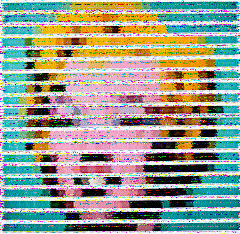
Our painting of the week is a rendition of Andy Warhol's "Marilyn Blue" done using Pantone color chips as pixels by Nick Smith. https://tinyurl.com/rrmkr38f
Caption not received.
30-minute broadcast began at
2026-05-07T23:30Z
Image
not
received.
Image
not
received.
Image
not
received.
Image
not
received.
Image
not
received.
Image
not
received.
Image
not
received.
Image
not
received.
Image
not
received.
Image
not
received.
Image
not
received.
Image
not
received.
Image
not
received.
Image
not
received.
30-minute broadcast began at
2026-05-09T02:30Z
Image
not
received.
Image
not
received.
Image
not
received.
Image
not
received.
Image
not
received.

Image
not
received.
Image
not
received.
Image
not
received.
Image
not
received.

Image
not
received.
Image
not
received.
Image
not
received.
Image
not
received.
Image
not
received.